by Paul Woodrow
C.Wells has described his work as being “post-aesthetic, signaling the primacy of intellectual reasoning over aesthetic selection”. This apparent strategy reminds me very much of Marcel Duchamp’s preference for art at the service of the mind rather than the retina. The marriage of the aesthetic and the conceptual seen and understood within the context of Western art in the Twentieth Century has always been a difficult one. The conceptual Art movement of the sixties and Seventies completed the rupture with traditional aesthetics initiated by Duchamp. In opposition to the art of late Modernism a la Greenberg, Conceptual artists not only revealed the ideas and concepts upon which their work was based but also took responsibility for framing their own propositions. Conceptualism’s critical attack of Formalist painting, in particular, produced a rift between visual artists and idea artists, which still can be felt today. Contemporary manifestations like the hybrid forms of installation, performance, and media-based art still pay homage to the conceptual movement, in some cases unknowingly. The growth of the anti-aesthetic movement in the Eighties and Nineties as well as the plethora of socially critical discourses have secured, for now, the value of intellectualism.
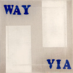
What is also important to consider when examining the works in this exhibition is the role of codification. Wells would like the viewer to consider them as belonging to some system of communication or semiosis. Even the title of the exhibition [A to B: Post-aesthetic Painting] suggests a context and a logic, which refers to the world of signs, syntax, semantics and specific viewers, as well as art history. The tongue-in-cheek reference to Sixties Minimal Art (ABC Art!) introduces an element of irony, even though Wells might want to limit the possible readings of the works to more contemporary related concerns.
Before singling out specific examples, it might be appropriate to identify the filters or screens through which the work can be discussed. In terms of aesthetics, Wells wants the viewer to shed his/her phenomenal body – the notion of body which is primed for aesthetic experience (the physical/sensual/emotive) in favour of a more mental approach – a posture that is more calculating, that is distanced, accompanied by a sense of physical loss. Through this screen individual works can be read as Modernist, in that they employ many of the conventional modes of Modernist representation. Wells’ works make it possible for the viewer to witness the transparent practice by which modernist objects are implicated in the process of distanciation and control. Wells also employs the notion of artistic abstraction to the same degree, drawing parallels between artistic contexts and social spaces. Suggesting that in certain types of Modernist painting, when the aesthetic component is removed, stripped bare, we are left with diagrammatic forms, which talk more about the limits and division of social space than possible sites for contemplation. Another way of discussing this issue is to suggest that the museum or gallery wall plays a decisive role in limiting interpretation to a more passive institutional response than one, which is more socially active or self-critical.
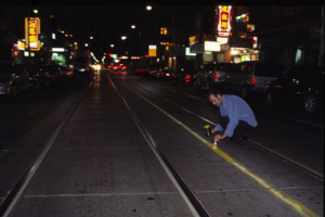
One of the most interesting aspects of the work in general is that it relies on ambiguity and illusion as its central attribute. A cursory glance at the canvases displayed might indicate that Wells has attempted to revive or re-establish Minimalist painting and the Geometric Abstraction of the Sixties. The paintings are graced by a reductive palette of what appears to be primary colours and black and white – those colours that we associate with artists like Piet Mondrian, Elsworth Kelly, Yves Klein – yet on closer inspection we realize that the colours used do not possess the exactitude of the colour wheel, but are factually those hues used by road workers, labourers, and city employees. Thus, Wells presents the viewer with a paradox: Is it possible to distinguish the presentation of what art looks like (and its codes) from what appears to be a playful yet serious simulation of it? The use of utilitarian line marking paint, the paint that is used on roads and highways, yellow, black, white, blue and red becomes a critical issue. This is nothing new in itself, as there are many examples of artists using so-called “non-artistic” mediums to produce art works. What are more important are the associations that this particular type of paint and range of colours have for the viewer. The formulated paint possesses particular characteristics, designations and alignments that we encounter everyday in our lives. These are the colours that divide our avenues of communication and regulate lanes of transportation, separating left from right, defining a metaphoric social space that reinforces our thinking. Road paint helps articulate directions that must be followed within social and cultural spaces. Particular delineations and colours enforce predetermined individual judgments, removing a certain degree of choice. They also act as agents of the law. They dictate. They are implicated in the formation of ideology. They grant permission for certain actions to take place yet deny others. They make servants of those who must obey their specific formations. In the end,. They are tools responsible for spontaneity within social spaces.
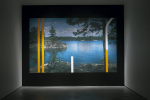
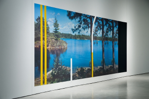
Single, Undivided comprised of three canvases placed side by side, could easily be considered as the iconic road painting. It not only replicates the appearance of a particular site, but also acts as an index of social order. What is interesting in this work is not so much the presence of the painted area as the fact that each area appear the same – as if what is represented is a continuous desire for symmetry and order which can be accounted for and contained within the edges of the frame. However, what is on either side of the linear divisions is of little importance, as long as the content of both sides remain the same. À pied in its display of both yellow and white demarcations, shifts the emphasis from a conventional perspectival reading to a diagrammatic and structural representation. This is not a view but the display of a series that give order and direction to our social spaces.
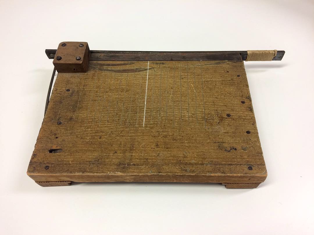
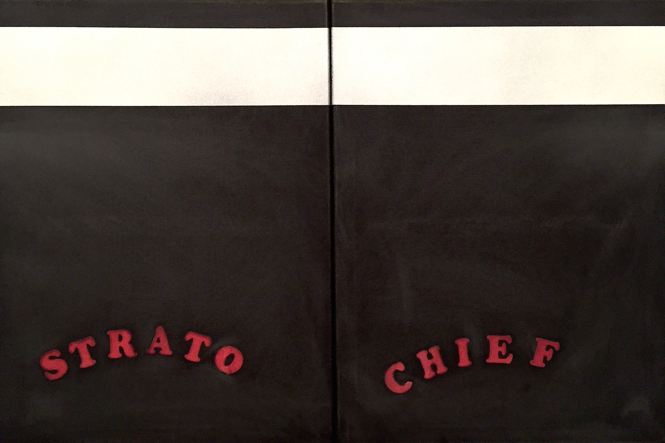
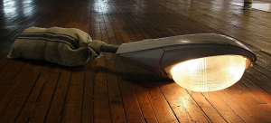
A to B (the Bernie Moore piece) has quite a different effect on the viewer, in that what is presented is an historic artifact, an implement that is now redundant, the line marking template. It casually leans against a small yellow abstract painting, as if forming an odd couple, perhaps acknowledging the fact of their own superfluity. The unsettling and punctilious relationship creates a sense of longing which hinges on nostalgia and loss. Whether or not this piece is read as ironic is, of course, the viewer’s prerogative.
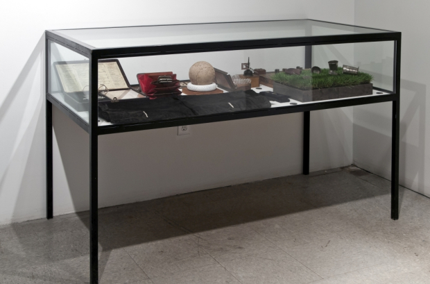
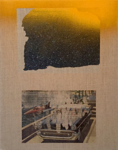
The interactive piece entitled Painting England, which takes on a three-dimensional rectangular form, incorporates a soundtrack, which is activated by the viewer’s touch. When lightly rubbing the left hand side of the box-like form, we are greeted with the repeated phrase” left hand side”. There is something enigmatic about this piece, which unites the gradual erosion of an object’s painterly surface with continuous human interaction – read touch. There is also something quite banal and futile about the nature of the mechanical response. In the preservation of ideas, the canvas becomes a site, which bears the traces of labour. Only four directions of application are used in the accumulation of brush strokes. What is visible on the canvas surface is an image in which is embedded the history of its own production. In addition, the aluminum boxes located at the base of the canvas contain accumulations of substances, the total effect of which is to give the piece a shrine-like presence. Their commonality is that they participate in a collective destiny.
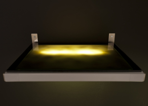
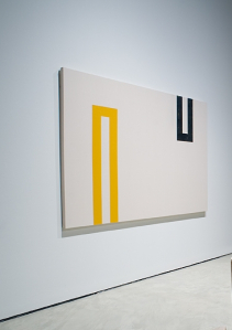
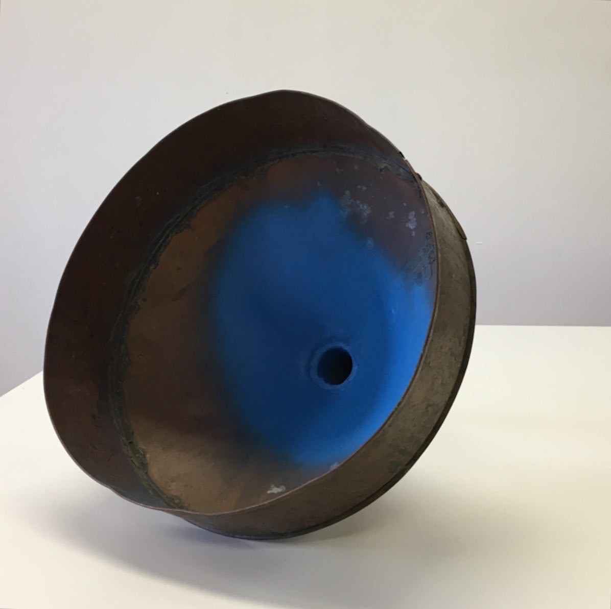
In the works which resemble single colour field paintings (the British Columbian and loco citato), colour relates to site – the red referring to the specific markings found at the higher altitudes of British Columbian mountain ranges, the blue designating areas which are for handicap use. The frames, which surround both colour field surfaces, appear to be mis-registered in an attempt to create an interference in the reading of these works as art objects. Both pieces have been enlarged from diagrams or sketches, and Wells has tried to retain that quality of rawness present in the smaller works. Wells has also attached thermometers to two of the canvases (Interior/Exterior), and a spirit level to another (No.1), which link the objects to reading and measurement, reinforcing their objective characteristics.
To return to Wells’ initial premise, the question of post-aesthetic painting, I would like to make the following observations. Within the contexts of Twentieth century art and contemporary art practice, there exists a variety of critical models, theoretical positions, and interpretive strategies, each linked to particular codes of viewing. It seems to me that the most important work addresses critical issues arising from these approaches. This does not necessarily imply that theory does not precede practice, nor that content is restricted to the boundaries of art. When Wells describes his work as post-aesthetic, he is making a claim for it. He is challenging convention. One might characterize this approach with the familiar epithet, “Avant-Garde” or even with the derogatory label of “Anti-Art”. After all, Wells wants to remove the aesthetic component from artworks and yet remain within the walls of the institutions.
There is another way of addressing the questions posed by Wells. Since we no longer totally inhabit a world formulated as a Modernist construct, issues concerning the Avant-Garde and Anti-Art seem redundant. What is at issue is the meaning of Wells’ work, not whether it is art or non-art, or even, for that matter, whether it is aesthetic or non-aesthetic. I have attempted above to formulate some interpretations. In summary, there is a subtle distinction between this work and Modernist painting. The works in A to B are mostly reproductions, replicas or reformulated displays. What is notably absent is the sense of originality or newness associate with Modernism. Neither are the works “ready-mades”. They are also not what they claim to be. What I sense is the presence of irony, an irony through which the paintings can be seen as posing – a type of strip tease – revealing all by not exposing too much.
Paul Woodrow is an artist, and Professor of Art and Theory at the University of Calgary.